Like many states, California spent years rating and ranking its public schools. The recently abandoned practice of calculating an Academic Performance Index (API) was perhaps slightly more robust than some systems, as it included more than standardized test scores, and the rating was contextualized with two decile rankings: one based on the overall API, and one comparing schools with similar demographic profiles. The highest rated schools were often described as “ten-ten” schools, in the tenth decile overall, and in the tenth decile for similar schools. A school that came out as a “five-ten” might point out that while they were in the middle of the pack overall, they excelled compared to similar schools, while a “ten-five” school might be given reason to pause, excelling compared to the state but in the middle compared to similar schools.
I taught at one of those “ten-ten” schools for three years, and drove over 50 miles a day round trip to do so. I gave up that position in 2002 and took my current job (round trip: four miles), which also happened to be at a “ten-ten” school. As similar as the rankings were, and as similar as the general qualities of the communities might be, there were significant differences between the two schools, particularly in the quality and variety of course offerings. Setting aside the underlying reasons for those differences, I can say from firsthand experience that identical rankings can be quite misleading about student learning experiences.
California no longer uses the API system (more on that in a moment), but its absence hasn’t stopped the demand for some way to rate and rank our schools. Niche.com is a Pittsburgh-based company using a combination of publicly available data and survey responses to offer their own version of K-12 and college rankings. To their credit, Niche offers users some insights into their methods, meaning that you can see what data they entered into their formula. As far as any rationale for their inputs or weighting of data, nothing. Their data team may be quite facile with numbers, but in viewing team members’ profiles on LinkedIn, I found no indications of relevant experience in either education or public policy.
My suspicions about their approach go back over a year, back to the moment when I first saw this headline: “Palo Alto Schools Sweep Top 11 Spots in California Rankings.” (The article isn’t worth linking to, but you can search for it on Patch.com). Now, as both a teacher and parent in the district, I can attest to the quality of our schools. But I’m also an advocate for our public schools more broadly, and I visited dozens of wonderful California elementary schools when working on my book, Capturing the Spark: Inspired Teaching, Thriving Schools. I’ve seen firsthand how varied our schools are, and how many different ways a school can excel at meeting the needs of its students and community. The idea of any one, or eleven “best schools” in a state with several thousand elementary of schools serving about 500 cities and towns is ridiculous.
Setting aside my personal skepticism about such rankings in general, I would hope that anyone viewing these results would recognize that there is an obvious problems here: the folks at Niche.com have intentionally or accidentally devised a formula that does an excellent job of identifying schools in Palo Alto, and they have no particular interest in correcting it. Since the publication of that elementary school list, Niche.com has also ranked all three of our town’s middle schools as the top middle schools in the state, and our two high schools occupy spots #1 and #5. If you bother to view the listings (I hope you don’t), you’ll see options to click for more information about the school, and, more tellingly, a link to view houses for sale in that area.
While the Niche.com example can be dismissed as statistical gimmickry to sell real estate advertising, there is still a segment of the education policy community clamoring for California to return to the practice of using ratings and rankings for accountability purposes. Our state has changed its approach to education policy in a number of significant ways in the past few years, adopting a new funding formula and new local accountability programs, and fighting the U.S. Education Department regarding standardized science tests not aligned with currently adopted teaching standards. In this climate of change and transition, the State Board of Education correctly concluded that the API scores were too narrow as indicators of school quality.
For more information about the dashboard and color-coded report, see: http://www.cde.ca.gov/ta/ac/cm/
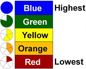
The new model, known as the “dashboard” approach, is now coming online. Instead of that single number and its decile placements, we now have an array of information about schools, presented in a color coded panel (depending on where you look). In the long run, the dashboard is expected to present ten kinds of data about schools, six that are uniform across the state and four that vary. There are plenty of questions at this point, and even those of us who endorse the concept, maybe especially those of us who endorse the concept, have reason to worry about issues like the quality of the data used, and the lag time in reporting.
There are voices in the education policy realm suggesting that this approach leaves families and other stakeholders uncertain about the quality of a school. They claim the dashboard is too complicated, because apparently, the many factors that contribute to school quality must all be reduced to a single number in order for a final judgment to be reached.
For example, Students Matter (sponsors of the failed Vergara v. California education lawsuit), argues that “Instead of overwhelming parents with too much information, we need a system that makes it easy for parents, families and communities to compare schools and advocate for their children.” Just as in the Vergara case, the organization fails to understand how schools work. A simplified system actually doesn’t make it easy to compare schools in any meaningful way; rather, it offers the illusion that we can accurately compare schools in ways that distort them beyond usefulness.
It is only through this kind of dashboard approach that you might begin to make some useful comparisons, because, ultimately, a singular rating masks many essential issues people really care about. If the general public has developed a taste for simplistic ratings and rankings, it’s because we’ve given out that information for too long.
Who benefits from over-simplified ratings? Real estate agents, the media outlets that run their ads, and the “school failure” industry of charter organizations and other reform outfits that thrive on identifying the failing schools in need of their fixes. What if presenting more complex pictures makes it harder to label a school as a failure? Does the market for consultants and proprietary solutions shrink?
I disagree with Student Matters or others who argue that more robust information will be too difficult for people to understand. It actually might be self-serving to argue a dashboard will “overwhelm parents” and inhibit their ability to “advocate for their children.” After all, Students Matter was created by a wealthy tech executive seeking to litigate changes in education policy, based on a rather thin understanding of schools. There was no groundswell of parents trying to bring the Vergara lawsuit, relying on simple school ratings to justify their advocacy. If anything, more robust information will make it easier to identify areas of concern, and to target advocacy efforts towards more specific goals.
Whatever the current shortcomings of the dashboard approach, Californians would be wise to advocate for its gradual improvement, rather than return to simplistic ratings that never meant as much as they were supposed to in the first place.
First published on Capturing the Spark at EdWeek Teacher, March 27, 2017.